Dafen oil painting Village
Wall Art Secrets: Placement, Pairing, and Framing That Transform a Room
When does a newly renovated house truly start to feel like home?
Probably from the day you hang up the paintings you personally chose, or place those beloved objects in just the right spot.
If it’s only about appreciating a painting, you could simply hang it where it’s most visible. But most of the time, wall art acts more like a seasoning for space—the key is not just owning the art, but integrating it harmoniously into the room.
1. Form follows function
In the documentary The Samurai Architect, there’s a humorous scene:
Architect Tadao Ando is inspecting a construction site and notices that a restroom sign was shifted slightly to the right. The staff had aligned it vertically with the warning light above—thinking it looked more photogenic.
But Ando objected: the sign’s placement would mislead people into turning right instead of going straight. He insisted it be moved back to align horizontally with the light—functional clarity over mere aesthetics.
This kind of subtle “misleading” happens often in public spaces: signage placement can unconsciously direct how people move.
The same principle applies to decorative paintings.
For example, imagine a hallway where every wall is filled with art—but one painting is cropped, showing only half. That little clue suggests “something continues around the corner,” subtly inviting you to step forward and explore.
In interiors, this technique is common:
- A bare corridor feels bland. Add paintings, and suddenly the space gains direction.
- Hang a piece near a doorway, and it naturally draws the eye toward the entrance, hinting at the room beyond.
- Place art at the end of a corridor, and it signals clearly: “This is where the path ends.”
Wall art doesn’t just decorate—it orients us.
2. The best ways to arrange and combine
In landscape design, there’s a technique called “solitary planting”: placing a single tree on an open slope, so its form stands out dramatically.
The same logic applies to art.
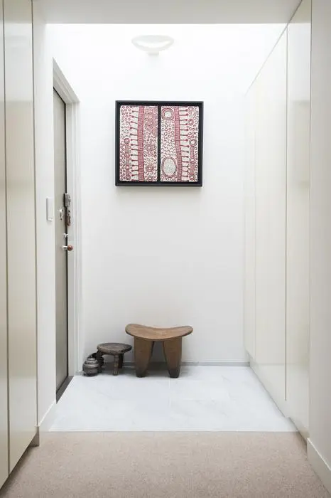
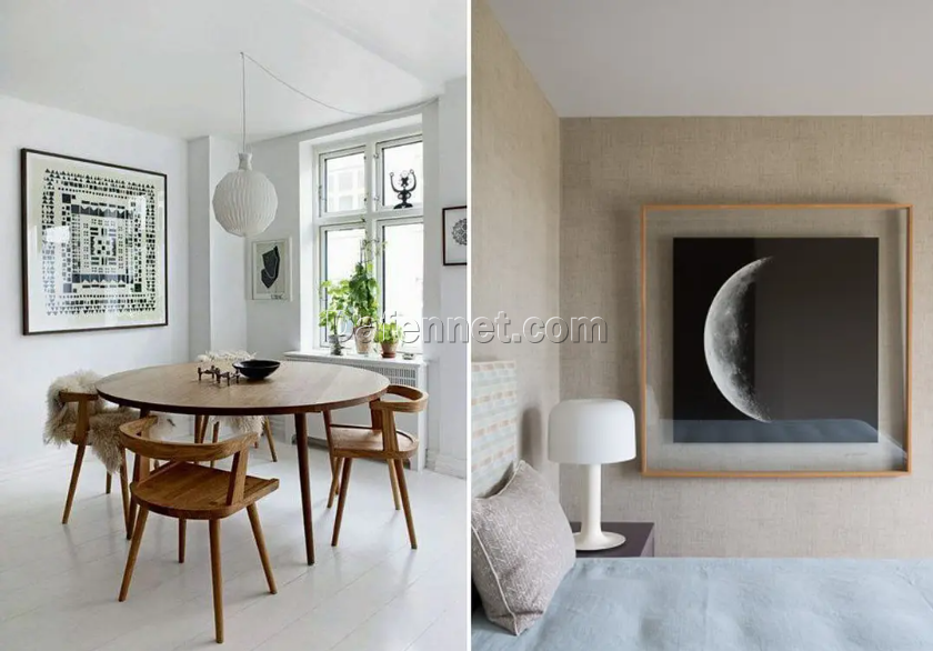
- A large single canvas can dominate a room and become its focal point—something smaller works rarely achieve.
- The impact of a solitary oversized piece lingers in memory, so it’s worth investing thought into choosing artwork that feels distinctive and not cliché.
Size and proportion
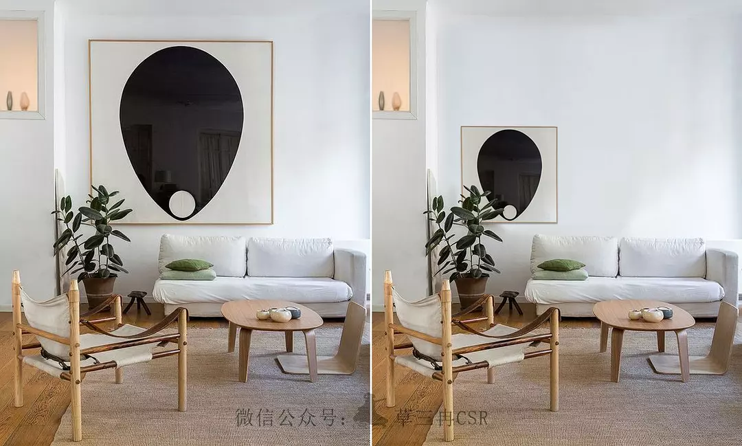
Many people instinctively pick paintings scaled to the wall, but that often feels rigid and formulaic. A bolder approach—using “contrasting” proportions—creates more life.
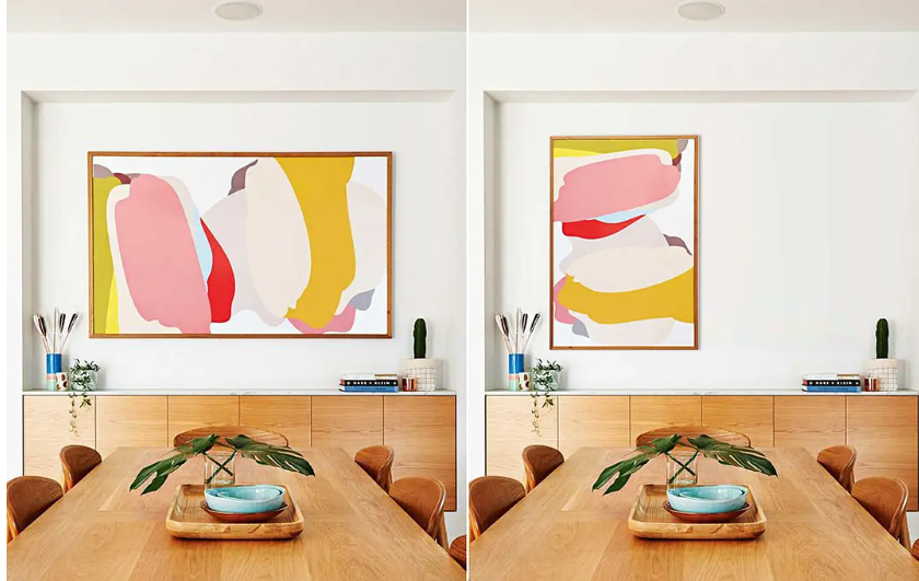
When unsure, square frames are versatile: they balance well with most wall ratios.
If large-scale art isn’t available, you can mimic the effect with paired compositions (“duo planting”):
- Symmetrical pairing (same series, identical frames) creates dignity and formality.
- Offset pairing (shifted height, rotated orientation) softens symmetry into balance, giving a relaxed mood.
For three pieces, avoid strict linear hanging—it looks stiff. Instead, use triangular composition: start with the largest piece, then cluster the smaller ones nearby, adjusting spacing until it feels right.
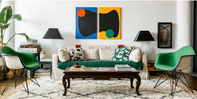
Beyond three, we enter “group planting” territory.
- A grid of identical frames builds rhythm, order, and grandeur (common in classic interiors).
- Spacing is critical: too tight feels suffocating, too loose feels chaotic. 4–5cm between frames is a safe rule, adjusted for frame thickness.
- Furniture partially overlapping a grid softens harshness and adds depth.
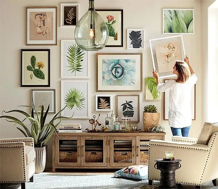
Then there’s the gallery wall—an informal, eclectic arrangement of mixed artworks, photos, postcards, even letters. Perfect for those who want personality over order.
Tips for gallery walls:
- Start with the largest piece at the bottom or edge, then build outward.
- For a more formal look, center the most striking work at eye level and expand around it.
- To push creativity further, extend the gallery across a corner: two large anchor pieces at the bend, filled out with smaller works.
Gallery walls are highly personal and evolve over time. Don’t rush to fill them with generic prints—curate, update, and let the wall grow with your life experiences.
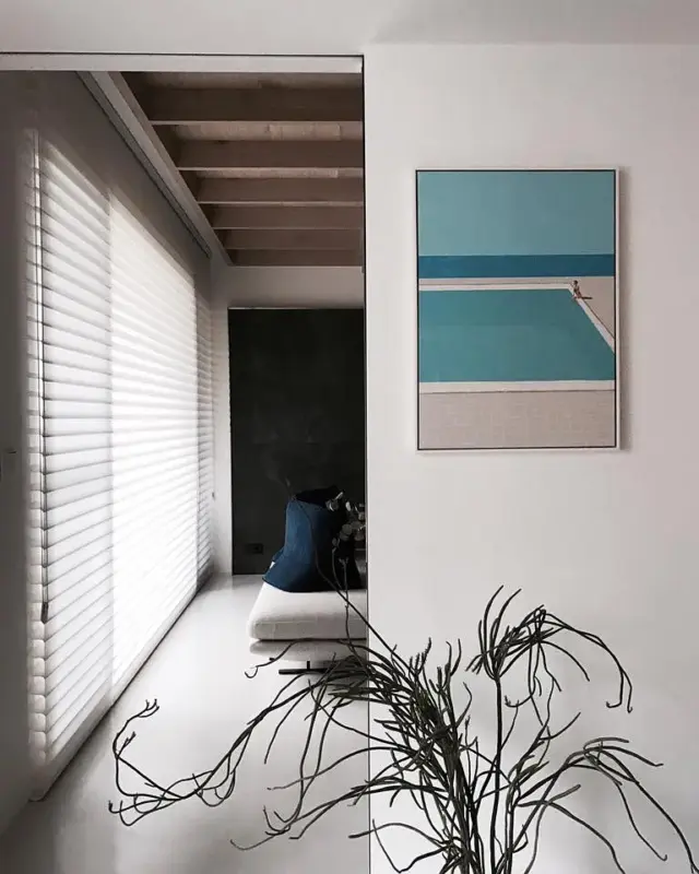
3. A good painting deserves a good frame
If you’ve mastered placement and composition, the final key is framing.
Frames are the transition between artwork and wall.
- Thicker frames, or wider margins, create more breathing room.
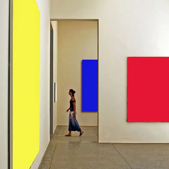
- Bright, colorful works often shine frameless, emphasizing bold impact.
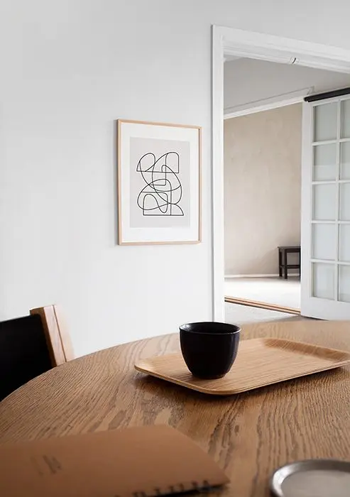
- Black-and-white photos or abstracts pair well with matting or floating mounts for depth.
Frame choices even affect how a room feels:
- Light-colored frames make a wall expand, enhancing spaciousness.
- Dark frames pull focus inward, emphasizing the room’s boundaries.
Color matching can unify the space:
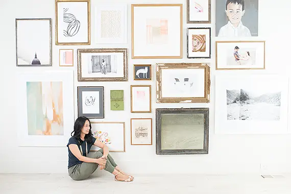
- Pick frame colors from the artwork itself to spotlight the painting.
- Or match frames with flooring or the room’s darkest tone for cohesion.
Don’t fall for the trap that “classic rooms need ornate frames, and modern rooms only suit minimal ones.” Mixing styles can create intrigue—like a baroque frame in a sleek modern space, as long as colors subtly connect.
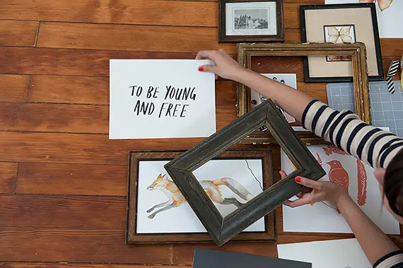
Frames aren’t just decoration—they set mood, balance, and weight in the room.
Final thoughts
Many people hang art merely to “fill empty walls.” But placement, form, and style all shape how we move through and perceive a space.
Wall art is never just decoration—it’s a subconscious compass, a mood-setter, and a storytelling tool.
Hopefully, this gives you fresh inspiration for your own interiors. Next time you hang a painting, you’ll see it not just as art, but as an integral part of space design.

